12.15.2010

12.05.2010

FASHiON DESiGN
 |
| http://widgetsandstone.com/page/projects/i-heard-a-voice |
 |
| http://www.hipgirlie.com/2008/02/26/fashion-designer-sketches/ |
 |
| http://www.designedesp4u.com/ |
geoGreeting!

The juxtaposition of word and image is very strong in this online program that lets you type in any message you want into a text box, and the program then translates it into aerial photographs of buildings taken from around the world that resemble each letter in the alphabet. It uses the actual images shot from above ground and takes the place of a particular typeface, such as Georgia or Times New Roman. This convention forces people to look at photographs of building structures in new ways and expands the realm of possibility in the design world.
11.29.2010
Stiletto Situation
 |
| http://xmb.stuffucanuse.com/xmb/viewthread.php?tid=3749 |
 |
| http://www.flickriver.com/groups/shoeaholics/pool/interesting/ |
 |
| http://www.theintellectualdevotional.com/blog/2007/09/06/the-early-days-of-x-rays/ |
After repeated use of stiletto heels, it seems inevitable that damage would occur in a woman's foot. Our feet are not meant to be elevated inches off the ground, but rather evolutionarily designed to allow us to walk bipedally to get from one place to another.
Fashion design in our modern society is rooted in pop culture to make a woman feel beautiful, even if it is not practical. Our culture as a whole places emphasis on women looking well-dressed and elegant at all times, because that is the female stereotype. It is essentially a woman's social responsibility to uphold this gender stereotype through pieces of designed clothing and accessories such as stiletto heels.
[SIGG]nificantly Less Plastic Waste

These water bottles can be refilled multiple times throughout the day, thus eliminating the need for any other plastic or aluminum drinking container. People can carry the same water bottle with them throughout their day, which not only saves them money, but also makes it convenient for everyone to stay hydrated and conserves our planet's resources. Aluminum water bottles are a first step in trying to reduce the amount of plastic waste generated by humans.
Plastic pollution has become an increasingly pressing issue. According to Susan Casey in her article titled, "Plastic Ocean," the total area of plastic waste gyres in our oceans covers "40 percent of the sea. 'That corresponds to a quarter of the Earth's surface,' Moore says. 'So twenty-five percent of our planet is a toilet that never flushes." There are even tiny balls of decomposed plastic bottles called nurdles that are too small to collect from the water. While it may be impossible, at least for now, to eliminate the damage that has already been done, things that have been designed, such as SIGG water bottles, will help reduce the amount of damage that occurs in the future.
11.28.2010
STOP! Design Ahead!

An object that would normally look like a piece of industrial machinery becomes an animated visual display of light and color. Though it employs basic colors of the RGB color model, each color takes on a life of its own. Red and green are two of the colors that comprise the RGB color model, as well as the color blue. When red and green light are added simultaneously, the result is yellow light. Traffic lights depend upon these basic colored lights to dictate when cars should stop, slow down, or continue driving.

While exact color descriptions can be subjective, according to Albers, there is still a science behind color theory. Therefore, we can understand the differences between colors as they relate to one another. Red, yellow, and green are unmistakably different hues, just as their attached meanings greatly differ. Red is symbolic of danger, yellow is representative of warning or cautioning, and green is associated with safety, or "all clear." These color meanings are incorporated into our society as accepted fact, so that if one disobeys the traffic light they are violating the law. Because we comprehend each of these colors in great contrast to one another, each light effectively catches our attention and triggers the appropriate response while operating a vehicle.
11.15.2010
Comfy Crocs

The original Crocs were never intended to take the place of regular shoes, but clearly people felt a strong desire for comfortable shoes to wear. In our modern society, shoe design doesn't always take ergonomics into consideration. This is especially true for women's high-heeled shoes. They are usually designed for narrow feet, with a long skinny stiletto heel at the back. Women tend to sacrifice comfort to squeeze their feet into heels to look "beautiful" and dressed up, even though they can induce pain and discomfort as a result of walking around all day in them.

The result of their effort led to women's flats, flip-flops, etc., and now they have even developed fashionable high-heeled shoes with orthopedic insoles. This heel falls under the category of YOU by Crocs on their website. By looking at this shoe as an isolated image, I'd never be able to tell that it was a Crocs brand shoe. It is much more elegant than what I'd normally associate with Crocs. Yet even though it abandoned the appearance of the original clog, it retains the comfortable quality of the classic Crocs shoe. This shoe is an successful design that incorporates the principles of ergonomics to come up with something that people would actually want to wear in their everyday lives.
11.14.2010
Climb the Stairs to Success
On an everyday basis, people encounter staircases - whether in homes, offices, or restaurants, or outdoor walkways. Stairs are something we don't pay much attention to until we walk up and down them at specific moments in time. Oftentimes, stairs either blend in with their surroundings or take on a more sculptural quality as something beautiful to look at and examine. It isn't until we embark on them that we pay attention to how easy it is to maneuver our bodies up and down the staircase. This is when people notice the ergonomic qualities of stairs.
 We can evaluate this cantilevered "floating" staircase in terms of Ergonomics Research. The first area of research is how safe the object is. By simply observing this picture, it seems that the staircase poses a safety risk. There are no railings for people to hold onto while walking up and down the staircase. In addition, each individual stair seems very spaced apart, which would make it easy to fall between them and down to the floor below. On a technical level, the actual structures themselves could become detached from the wall while someone is walking on it if they aren't supported enough. Navigating this staircase could definitely be dangerous.
The second area of research is how comfortable the object is. These stairs have a very austere, minimalisic feel to them, so they don't seem really comfortable. It appears that people would have to stretch their legs a little more than normal to get up or down the stairs, which could create uncomfortable body positions.
Along these lines is the next area of research, ease of use. By having to extend your limbs into wide strides on a structure with nothing to hold on to, it seems kind of difficult to use this staircase. To maneuver around on the stairs, you have to lean against the wall for support while also physically exerting yourself which doesn't seem very practical.
In terms of this staircase's performance, the stairs themselves depend on people's interaction with them to function. Given all of the risk around these stairs, it seems they don't have a high performance rating for functional use. However, they do perform well by enticing people to interact with them as an overall structure. It isn't often that people have the opportunity to climb onto sculpture-like objects to actually get from one floor to the next.
The last area of research, aesthetics, is probably the most successful aspect of this staircase. Even though they might not be the most efficient stairs, they are extremely visually pleasing. Their visual appeal stems from the fact that they are minimalist, yet arranged in a way that intrigues the viewer. Each individual stair is a parallelogram cantilevered out from the wall. The staircase combines each of these geometric shapes into an overall structure with a curvature from one wall to the next, spiraling into a different direction where the two walls meet in the corner. The juxtaposition of harsh geometric wooden boxes and the soft curvature of their placement makes the stairs interesting and dynamic to look at, even if it is as more of a sculpture installation than a real, usable staircase.
11.08.2010
Drowning in Words


His way of describing the events that took place through unified visual and textual language is very successful. Without having to narrate the entire story, his comics explain the process by means of graphic information. The combination of words and pictures throughout the book enhance the design to make it as clearly understandable as possible.
The Skeleton of Words

She uses the basic shape of a human skeleton and redefines the concept of an anatomical diagram of the human body into the language of design.
Rather than simply drawing the contour lines of each bone in the human skeleton with a line pointing to that bone's name and label, Parkin incorporates the labels into the structure itself. Therefore, the skeleton is literally comprised of words. The chest, for example, is made of strings of the word "rib," bent into curved lines to look like actual ribs. The shape of the pelvic bone is formed by a repeated use of the word "pelvis" in varying font sizes to mirror the curvilinear shape of a real pelvis.
Though her version of the human diagram doesn't convey completely accurate bone structure, it gives a general sense of where each body part is located and presents the textual information as something that is aesthetically pleasing to the eye. It is beautiful in its own right, due to her careful design choices and unique approach to representing the human figure.
Zebrazebrazebrazebra
Frequently, words and images are considered two completely separate entities. Words are thought of as text that communicates a message, while images are a type of artistic mark-making. Most people assume that writers are not the same as artists, simply because they aren't composing forms, shading, or employing the use of color to fill in spaces. Yet there are many people who push the boundaries between the two, knocking down the barrier between visual and textual information to invent new methods of expression. As such, words and images can work together to create interesting designs.
 For example, this image done by Jarrell Goh depicts the eye of a zebra. At first glance, it looks like a fairly realistic rendering of a close-up view of the side of a zebra's face. You can see visible skeletal structure in the face and a dark spot where the eye is located. But the longer you stare at the image, the more things become revealed to you. It isn't a real zebra at all; in fact, the artist used text to define the zebra's black stripes. The zebra is in fact an illusion of a naturalistic animal created through repetition of the word "ZEBRA" in different sizes and distortions within the composition. Thus it isn't even an animal at all, but a flat, two-dimensional display of the word "zebra" in a bold, uppercase font.
This is a case where word and image merge with one another to create a false three-dimensional quality in the composition. The integration of the word "zebra" to create strings of text in the composition becomes recognizable as an actual zebra head. It is difficult for our minds to understand it as a flat manipulation of text on the page because it reads so strongly as a zebra.
This is a case where word and image merge with one another to create a false three-dimensional quality in the composition. The integration of the word "zebra" to create strings of text in the composition becomes recognizable as an actual zebra head. It is difficult for our minds to understand it as a flat manipulation of text on the page because it reads so strongly as a zebra.
11.01.2010
OBJECTIFIED
Last week in class, we watched the documentary Objectified, directed by Gary Hustwit. From the very beginning of the film, it was clear that form and content were closely related. Throughout the entire documentary, the featured objects and designs in the film were emphasized more than any of the people who voiced their ideas. Often the person speaking would be filmed for a few seconds, and their name flashed across the screen. But soon afterwards, the film switched to zoomed in footage of the objects being discussed, while the speaker's voice continued in the background. The documentary's format reflected its subject matter because the film successfully highlighted the importance of the objects being talked about, thus supporting the title, Objectified.
Within the substance of the film, many designed objects were shown. Each description of an object became an isolated example of how form and content intersect in regards to the way people interact with the design of that specific object. One object that stood out to me was the Japanese toothpick. It was designed so that you could break off the top of it and use that as a way to rest it on the table without it touching the dirty surface. Most toothpicks are simply wooden sticks, but the detachable part of this Japanese toothpick, its unique "form," matches up with the performance of that toothpick, or its "content."
In yet another example from the film, form and content interacted in a different way in regards to an individual and his or her vehicle. According to the film, we choose cars for ourselves that meet certain needs we have based on our own personalities. Therefore, the car's aesthetic and performance qualities become extensions of who we are, almost giving the object a human quality. We personalize our cars with bumper stickers and other accessories so that the appearance of the car and the meaning behind the personal touches we add to it convey something about who we are as individuals to the rest of society. Instead of just looking at it as a machine to transport ourselves, cars become almost like a second home for their owners. This personal touch in vehicles is different from other objects discussed in the film, which we tend to take for granted. We don't realize that so many basic things have been designed to be as simple and easy to use as possible, and we certainly don't have a strong emotional attachment to them.
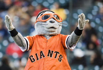
What is Orange, Black, and Seen All Over?
 |
| http://www.soyouwanna.com/Content/images/store/3/9/438e9d38-c24c-1156-19d7-460012ddecaf.Full.jpg |
What do jack-o-lanterns and the San Francisco Giants have in common? They both employ the use of the colors orange and black. In the spirit of this past weekend's Halloween festivities, I would like to examine the symbolism of certain color combinations and the role that colors have in defining things like holidays and sport teams.
It is widely accepted that Halloween colors are orange and black, just as everybody knows that red and green symbolize Christmas, and red, blue, and white represent the United States of America. Each color combination designates a different holiday. The intentional design of these particular color "labels" distinguishes each major holiday from one another so that they can each be assigned their own decorations and paraphernalia. Using these colors as a basic foundation, people adorn their houses with holiday-themed decorations. Some people create such elaborate decorations that their homes become spectacles for the general public, whether it be carved pumpkins on the porch or nativity scenes on the front lawn. In some cases, people transform their homes into haunted houses or Christmas displays and let strangers walk through to observe their hard work firsthand. When this happens, the color themed decorations establish a sense of community in the neighborhood, bringing total strangers together to admire someone's impressive talent.
It is widely accepted that Halloween colors are orange and black, just as everybody knows that red and green symbolize Christmas, and red, blue, and white represent the United States of America. Each color combination designates a different holiday. The intentional design of these particular color "labels" distinguishes each major holiday from one another so that they can each be assigned their own decorations and paraphernalia. Using these colors as a basic foundation, people adorn their houses with holiday-themed decorations. Some people create such elaborate decorations that their homes become spectacles for the general public, whether it be carved pumpkins on the porch or nativity scenes on the front lawn. In some cases, people transform their homes into haunted houses or Christmas displays and let strangers walk through to observe their hard work firsthand. When this happens, the color themed decorations establish a sense of community in the neighborhood, bringing total strangers together to admire someone's impressive talent.
 |
| http://cdn.bleacherreport.net/images_root/slides/photos/000/169/538/LouSeal_display_image.jpg?1267793049 |
So to answer my earlier question, both Halloween and the San Francisco Giants exemplify the use of color schemes as unifying elements of a common interest group. Though jack-o-lanterns and sports fan gear aren't related on a surface level, their underlying similarity lies in their ability to connect people through things such as holiday and/or team spirit that each individual is passionate about.
Toaster Story

The appearance of a toaster suggests its function. The most common use for a toaster is to put in two pieces of bread - an average serving size for one person - which will then be consumed. Because most people eat about two pieces of toast at a meal, the toaster has two rectangular shaped slots that mimic the shape of bread slices, in which to place the bread, or perhaps two halves of a bagel. The toaster's silhouette mirrors the rectangular shape of the slots, thus the contour of the toaster is inspired by a slice of bread.
Because toasters perform such a simple procedure, they are designed with facades that are visually appealing. The smooth texture of toasters make them look sleek, new, and shiny because the smooth surface reflects light. It also prevents crumbs from getting stuck to it, which could happen if the surface texture of the toaster was more rough or bumpy.
The design of the buttons on the toaster accentuates their function as well. The buttons stick out from the toaster's side, and their three-dimensional quality makes these controls the focal points of the toaster. Since these are the buttons that make the toaster operate, it makes sense that they would employ a staccato type of surface to attract the attention of the person using it.
One flaw with the toaster oven is that it is such a minimalistic design that it lacks a system for actually removing the bread from the slots when it is hot. In my experience, it is very easy to burn your fingers trying to pry bread out of the holes. If there were some kind of tongs attached to it, it would be safer for people to use.
10.24.2010
Good Night Moon
 |
| http://www.artmatica.ch/blog/files/tag-moon-craters.php |
Andy Goldsworthy isn't the only designer who can look to the natural world for design inspiration. Moon Craters anyone?
10.23.2010
Good Morning World
 |
| http://belladia.typepad.com/bella_dia/getting_to_know_me/page/2/ |
"The best and most beautiful things in the world cannot be seen or even touched. They must be felt with the heart." - Helen Keller
10.18.2010
Comparing and Contrasting the Starbucks Coffee Logo

As a current barista at Starbucks Coffee in Dixon, California, I understand the importance of being able to walk into a Starbucks store anywhere in the world and be surrounded with a familiar environment that sells the same products. The Starbucks Coffee logo is omnipresent as a universal symbol of the consistent high-quality, hand-crafted espresso beverages available to the customer. The inspiration for this design comes from a siren; a two-tailed, half-woman, half-fish that seduced sailors with her beautiful singing voice. The symbolism behind this seductive figure entices people into the store to purchase coffee drinks. The Starbucks logo has become an icon that people all around the world can comprehend.
While the logo's current design is recognizable due to its simple line work and strong color contrast, it hasn't always looked like that. The original design for the Starbucks logo, used on the cups from 1971 to 1987, had a more elaborate illustration and a different color scheme. It was brown and white, and the text included coffee, tea, and spices. The siren herself was drawn in great detail, depicting a realistic female upper body that looked three-dimensional.
In 1987, the company redesigned the logo and ended up with...
this.
By changing the design, the logo became something appropriate for all ages, without the risqué nude female body in the first logo. As a result, Starbucks Coffee could appeal to a wider range of consumers and pull in more money. The new logo carries a more powerful visual presence than the other two previous designs due to its modern simplicity. Its use of bright green juxtaposed with the strong contrast between black and white makes the icon pop out at the viewer.
Both the 1971 design and the 1992 design represent the same company values and merchandise by using the a circular-shaped image of a siren, yet each logo employs very different design choices. These design choices impact each logo's effectiveness as the emblem of Starbucks Coffee. The original logo is subtle, and gives the impression that Starbucks is a local, small-town hangout spot. The nude female body seems to suggest that the store caters to a select group of people who are old enough to go inside.
On the other hand, the current logo has a more dominating presence that calls attention to the store. Even though some of the uniqueness of the original logo is lost, the "edited" version of the siren in the modern design makes Starbucks feel like a family-friendly place. Along with the change in logo came a shift in merchandise to include a wider range of non dairy and caffeine-free options so that more people could enjoy the Starbucks experience. While some of the charm of the original logo has faded with the new design, the ultimate goal is to create something people will recognize so that they return to that store on a regular basis. And with such a flashy logo, Starbucks will not be going out of business anytime soon.
10.17.2010
Tamagotchi Pets

Years later, my parents divorced and my mom and I adopted a kitten from the Humane Society. Once I had a real cat, the Tamagotchi virtual game seemed like a waste of time. Why would I spend hours upon hours pushing three tiny buttons to keep a virtual pet "alive" once I had the opportunity to play with a kitten in real life? It just simply wasn't the same. I eventually threw my Tamagotchi away because I no longer felt the same emotional bond with it that I once had.
So what does this anecdote have to do with design? As a DES 001 student, I started thinking about the implications of design on our emotions. How is it that a small digital image could have such an impact on someone? Clearly, it was designed with this in mind. The creators of Tamagotchi appealed to the human instinct of caregiving, present even in young children. It is an internal instinct to feel love towards other humans and animals, albeit a digital animal in this case. The game is designed so that the pet "owner" feels obligated to do everything they can to keep the animal alive, because if it dies you not only feel personally responsible, but you also lost the game and thus have to start over again.
The game also relates to design by employing the use of universal icons familiar to all people. The icons have to be easily recognizable so people playing the game can easily understand the needs and desires of their virtual pet. For example, the toilet icon means the pet has to go to the bathroom, the baseball and bat means the pet wants to play, the chef hat means the pet is hungry, the heart icon means they need more attention, and the cross represents the need for medical care. Essentially, the designers of Tamagotchi took the basic functions of life and simplified them into a few symbols displayed on a small screen, giving children the power to control another life from a very early age.
The design of Tamagotchi lets children explore what it means to help others. Even though it is actually just a few digital lines on a screen, the moral lesson of the game is so strong that it creates emotional attachment to something that doesn't exist. This game evokes a sense of love and caring that can be expressed in the lives of these children as they age. Although the excitement of the game fades away as children grow up, Tamagotchi educates children about fundamental life lessons in a fun way that they never forget.
Design as a Conversation
Last week in class, we discussed the idea of design as a conversation. To me, this means that design is a concept that sticks in people's minds as unique; anything that provokes an interesting discussion. It is also a communication between the designer and the observer, because the designer produces something that they hope will stimulate a response from the people who interact with it.
Music videos are a perfect example of design. The average length of a song is about three to four minutes, so the artist only has a finite amount of time to create the experience he or she wants to convey to the viewer. The video needs to be visually appealing and to-the-point, avoiding long, complicated narratives. It is a delicate balance between not enough information and too much information. If the video is a white screen with the lyrics of the song flashing across the page with the singer's voice in the background, people grow bored very quickly. But if the video tries to accomplish multiple plot twists within a small time period, it achieves the same effect of boredom because people get confused by copious details and become distanced from the visual experience of the video.
In this music video of the song "Cosmic Love" by Florence + The Machine, a current British song artist, the design concept is well-executed throughout the entire video. The viewer is first presented with the title "Cosmic Love." It seems to be a metaphor for being so deeply in love that the feeling spreads throughout the universe; the cosmos. Before even clicking the play button, a sense of awe and vastness is infiltrated into the viewer's mind. This feeling is carried throughout the music video. The way the singer is filmed makes her seem like a small part of a big universe, as if she is being controlled by an overwhelming sense of love. In every scene of the music video, she is either surrounded by falling leaves, sparkling lights in dark spaces, or rooms full of mirrors. Her outfits correspond with her environment, making her fit into the overall design of the visual experience instead of being emphasized as an individual human being. When she's in the dark, her outfit is black with dramatic cutouts, and at other times, her outfit is white and flowing with bright white lights integrated into the fabric. The mirrored walls reflect her large waving arm movements hundreds of times, portraying a false sense of depth, suggesting that the universe, or her love, is never-ending.
This music video raises an interesting design conversation. In making the design so omnipresent in the video, the human quality of the singer is somewhat reduced. Some people might argue that she is being objectified as something beautiful to look at, but I think that her seamless integration into the overall design of the music video accents the individuality of the singer and the way she chose to convey the message of the song. The fact that this video could stimulate discussion connects back to my original idea that the conversations of design feed off of unique, provocative projects such as the "Cosmic Love" music video. For another visual design experience, watch the Florence + The Machine, "Hurricane Drunk" music video. Her flowing outfits and dim lighting reflect the mood set by hurricanes, or in this case, emotional despair.
10.11.2010
J-E-L-L-O-W-A-R-E


In the spirit of the modern trend towards reducing waste and environmental hazards, these cups are the perfect answer. They completely consumable and fun to look at, and the seaweed extract in the cups helps grass grow, thus benefitting the environment. Humans use an abundance of plastic cups that end up as litter on the side of the road, but these cups will simply dissolve back into the earth if not thrown out (or eaten!).
As a current barista at Starbucks Coffee, I feel guilty every time I see a crushed Starbucks cup in a street gutter or strewn about in the grass along the freeway. I don't like being associated with the company that manufactures these cups, even though it isn't my fault that other people litter. I think Jelloware would greatly reduce our total amount of waste products. While it doesn't take the place of coffee cups, it could eliminate plastic cups used at picnics and other social gatherings.

10.10.2010
Creativity from Without
When I think of artists, my first assumption is that they are people who create works based on their own imagination, inspired by personal experiences. It is a common stereotype that artists express their own emotions through various materials, or media.
However, this stereotype disregards a more modern form of art that integrates pre-existing elements of the natural world into a final piece. Rather than artists creating "from within," they are instead creating "from without." This means that artists look for inspiration from the natural world in their work.
 An example of this type of art that I find fascinating is Japanese Rice Field Art. People have taken rice paddies, large green fields, and transformed them into aesthetically pleasing works of art. How is this possible? They plant different varieties of rice that naturally have varying leaf colors, allowing the plants to act as elements of light and dark contrast in the aerial images these crops become. These rice crop artists are essentially "drawing" an image by determining the location of each plant in the field.
 The amazing thing about Japanese Rice art is its large scale. In order to fully appreciate the contrast of the different colored plants, the fields have to be viewed from a certain distance above them. Up close, the plants do not appear to form any kind of organized visual image. It would be easy to overlook their beauty as a composition if one simply walked through one of these decorative rice fields.
 Another interesting element of Japanese Rice Art is that these rice field artists can create replicas of fine art pieces, such as the Mona Lisa. It is a juxtaposition of the permanence of ancient art and the temporary growth of rice crops. We normally think of art in the natural world as more abstract, such as making patterns with rocks and leaves, so the creation of Leonardo da Vinci's masterpiece in a rice paddy links this modern form of art to the legacy of the old masters of Italian art.
While most of the art created in natural environments isn't built to last, that shouldn't take away from its validity as a form of art. Whether it lasts for a fleeting moment, a few months, or multiple centuries, all art should be appreciated as a way for people to produce something beautiful and share it with others.
However, this stereotype disregards a more modern form of art that integrates pre-existing elements of the natural world into a final piece. Rather than artists creating "from within," they are instead creating "from without." This means that artists look for inspiration from the natural world in their work.


While most of the art created in natural environments isn't built to last, that shouldn't take away from its validity as a form of art. Whether it lasts for a fleeting moment, a few months, or multiple centuries, all art should be appreciated as a way for people to produce something beautiful and share it with others.
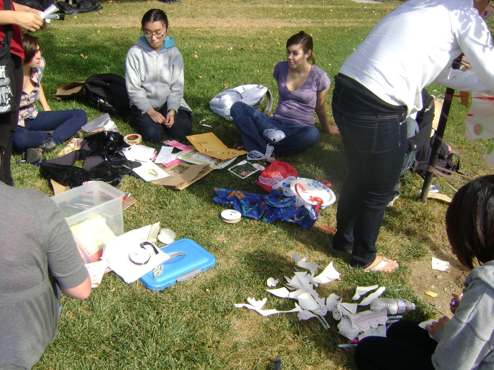
Stone Soup
In the novel Stone Soup, by Marcia Brown, three soldiers come into town and plead for food. Since none of the villagers were willing to cook meals for them, they started a soup consisting of only water and rocks. They began asking people for simple ingredients, one by one, until the whole town had contributed to the delicious soup that everyone shared. Though it was gone as soon as everyone had enjoyed some of their creation, the process of compiling ingredients brought a sense of camaraderie to the town.
 Last week, we experienced our own form of the "stone soup" process. While there was no food involved, we worked together with our group members to design a sculpture using materials that each person brought in. At first, no one in our group was sure where to start. We were all waiting for someone to initiate our project; shy about asserting our own ideas. But once a few people voiced their ideas, we all started working on individual parts of the design and attaching them to the tree post we used as a base. Slowly, our various ribbons, paper plates, and torn paper strips began to take shape as a unique sculpture. Just like the soup in Brown's novel, it was only a temporary creation, an ephemeral project, that was not meant to last. But while it was there, we all got to enjoy looking at it and appreciating what we all came together to create.

I really enjoyed this assignment. While parts of it reminded me of doing craft projects in elementary school, I also learned some bigger lessons about the design process. I think what stuck with me the most was the importance of collaborating with other people to come up with a design idea, rather than relying on one person to come up with an entire project alone. This leads to final products that one person couldn't have completed without help from a team.


I really enjoyed this assignment. While parts of it reminded me of doing craft projects in elementary school, I also learned some bigger lessons about the design process. I think what stuck with me the most was the importance of collaborating with other people to come up with a design idea, rather than relying on one person to come up with an entire project alone. This leads to final products that one person couldn't have completed without help from a team.

10.04.2010
Crafty, Creative, Crayola!

Is design most important as an element of commerce or are there other ways to conceive of design?
My answer? Yes, there are definitely other ways to perceive design! Take crayons, for example. Originally, crayons were designed to be functional art tools. Over time, the brand name "Crayola" has become so popular that it is synonymous with the term "crayon," similarly to how "Kleenex" has come to be widely understood as another name for "tissue." Adults worked together to design crayons, a collection of wax drawing implements, that catered to the target market of young children with their bold colors and playful names.
While it is true that the crayon was developed as a purchasable commodity, I wonder if the people who designed these colorful wax sticks might have taken it a step too far. The clever names for the colors might be confusing to the children using them. For example, does a kindergartener understand what "Mauvelous" means? Or do they know that according to Crayola, the color "Inchworm" means bright green? The company developing this product took great measures to create the look of each color's individual paper wrapper so that they all look identical with different color names printed on the side, but the subjective color descriptions might make their design too complex for a toddler to fully grasp.
With this in mind, I wonder if the real designers in this crayon scenario are, in fact, the people who use the product to create their own works of art. Instead of using crayons to earn a profit, as the original designers did, children use crayons to draw pictures before they even learn how to write or read. And adults such as Pete Goldlust employ crayons as a medium for ornate sculptures [Check out Pete Goldlust's website for some of his amazing crayon creations].
Then there are the people who are so enamored with the design of the crayon that they collect them. I remember in elementary school, we all compared our crayon sets to see who had the biggest set in their pencil box. Young children take pride in having more crayons than their peers. Other people collect the retired color crayons that are no longer being manufactured, which most likely cost more than they did in their original sets.
Admittedly, the people who are buying collector crayon items are feeding into the notion of design as an element of commerce. Perhaps the company designed their retirement of certain colors as a plan for the value of these crayons to go up so that people would spend more money for their products. But I think the more important message here is that people have come up with new ways to tailor the original design of the Crayola crayon to fit their own needs, whether it be drawing, sculpting, or collecting.
10.03.2010
Crawling My Way into Design

The brightly colored foods in the book catch my eye first. The richness of the colors suggest that the food gives off strong, delicious smells. What is particularly interesting is that these colored objects are not realistic looking, although the shapes are recognizable. Things like fruit, sausage, pickles, cheese, desserts, and candy are transformed into layers of collaged designs to depict the narrative. The choice to use such stylized depictions of ordinary foods contributes to the appeal of the story. It takes an event from nature, the life cycle of a butterfly, and presents it to an audience in a fun and unique way.
Another captivating element of this storybook is its layout. Each page has a hole punched out of it where the caterpillar has eaten his way through, giving the book a more three-dimentional sense as opposed to simply printing flat images on paper. The holes make the book more interactive with the audience. It creates a physical texture that indicates that the caterpillar ate through the pages of the book itself. The integration of the words in the story with the pictures of the food and the hole in each page result in a comprehensive design that is universally understood by people of all ages, even those who can't read yet.
When all of the creative elements of this children's book are combined, the end result is a successful design project. If this story had simply been a scientific explanation of the stages in the life of a butterfly, it wouldn't be nearly as memorable to me as a twenty-year-old.
9.28.2010
Designing our Future
I thought a lot today about how design applies to our everyday lives. In a sense, we design our lives beginning even before we are born - our parents might save up money for us for college, they buy us clothes and toys, and decide where our birth will take place. And it doesn't stop there. Parents choose the schools we attend, which in turn shapes who we become in the future. Each choice we make is part of the story of our life.
It is exciting to think that our future is in our hands, because we get to create the memories we carry with us for the rest of our lives and make decisions that impact the way we view our environment. What people tend to overlook is that even if they aren't an "artistic" person, they still have an understanding of design. It might be as simple as mapping out a career plan or a chores chart for roommates. Or when someone arranges the furniture in his or her living room, they are subconsciously making "design" choices.
Too often, people limit themselves to specific hobbies and talents. Every day, I hear people say, "Oh, I can't sing," or, "I've never been able to draw more than stick figures." But why not? I believe all humans are born capable of the same things, and it's just a matter of which strengths our social, environmental, and cultural surroundings condition us to focus on. In any situation, different perspectives make a conversation more interesting. If people were more aware of the way design plays a role in their lives, their various life stories would lead to a collaboration of ideas that even a well-known professional designer couldn't come up with alone.
Subscribe to:
Posts (Atom)