11.29.2010

Stiletto Situation

http://xmb.stuffucanuse.com/xmb/viewthread.php?tid=3749
Stilettos are a timeless fashion necessity for almost all women.  Women believe that high-heeled shoes make them look beautiful and well-dressed, and every female I know owns more than one pair of heels.  Yet no matter how beautiful a woman might feel while wearing her favorite pair of stiletto heels, these shoes are actually quite damaging to a woman's foot.  Though not as extreme as the practice of Chinese foot binding, as shown to the right, stilettos present their own set of foot problems.

http://www.flickriver.com/groups/shoeaholics/pool/interesting/
For example, this stiletto with a seven-inch heel might have a certain amount of sex appeal and glamour associated with it, but my feet hurt by just looking at the steep curve of the sole of the shoe.  I can't imagine walking very far in these shoes because it's essentially the same as walking on the tips of one's toes.  Furthermore, the heel is so thin that it probably doesn't offer much structural support.  This would put a woman's ankles at risk as well.

http://www.theintellectualdevotional.com/blog/2007/09/06/the-early-days-of-x-rays/
While this shoe's original design intent was not to create something that would be dangerous and hazardous to women who actually wear the stiletto, the risk of injury from these shoes outweighs their aesthetic beauty.  An unfortunate consequence of this design, the danger of breaking or spraining one's ankle or causing permanent damage to the foot is difficult to ignore.  This x-ray shows the contorted position of a woman's foot when crammed into a stiletto.

After repeated use of stiletto heels, it seems inevitable that damage would occur in a woman's foot.  Our feet are not meant to be elevated inches off the ground, but rather evolutionarily designed to allow us to walk bipedally to get from one place to another.

Fashion design in our modern society is rooted in pop culture to make a woman feel beautiful, even if it is not practical.  Our culture as a whole places emphasis on women looking well-dressed and elegant at all times, because that is the female stereotype.  It is essentially a woman's social responsibility to uphold this gender stereotype through pieces of designed clothing and accessories such as stiletto heels.

[SIGG]nificantly Less Plastic Waste

SIGG aluminum water bottles have greatly increased in popularity since the recent research about hazardous chemicals in plastic was exposed to the public.  People were worried about BPA being released into the water we drink.  Aside from drinking safer water, another benefit of using aluminum water bottles is their function in reducing plastic waste.  As a result, the SIGG water bottle constitutes a utopian design because it aims to improve the environment in our modern society on a relatively large scale.

These water bottles can be refilled multiple times throughout the day, thus eliminating the need for any other plastic or aluminum drinking container.  People can carry the same water bottle with them throughout their day, which not only saves them money, but also makes it convenient for everyone to stay hydrated and conserves our planet's resources.  Aluminum water bottles are a first step in trying to reduce the amount of plastic waste generated by humans.

Plastic pollution has become an increasingly pressing issue.  According to Susan Casey in her article titled, "Plastic Ocean," the total area of plastic waste gyres in our oceans covers "40 percent of the sea.  'That corresponds to a quarter of the Earth's surface,' Moore says. 'So twenty-five percent of our planet is a toilet that never flushes."  There are even tiny balls of decomposed plastic bottles called nurdles that are too small to collect from the water.  While it may be impossible, at least for now, to eliminate the damage that has already been done, things that have been designed, such as SIGG water bottles, will help reduce the amount of damage that occurs in the future.

11.28.2010

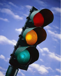
STOP! Design Ahead!

Everyone with a driver's license [as well as those who don't have one] should be able to recognize a traffic light.  It has become a universal symbol for "Stop, Go, and Slow Down" in our modern society.  But this machine's design would not be possible without the use of color.  The changes in colored light from green to yellow to red within the traffic light transforms its design to convey different messages each time the shift in color occurs.

An object that would normally look like a piece of industrial machinery becomes an animated visual display of light and color.  Though it employs basic colors of the RGB color model, each color takes on a life of its own.  Red and green are two of the colors that comprise the RGB color model, as well as the color blue.  When red and green light are added simultaneously, the result is yellow light.  Traffic lights depend upon these basic colored lights to dictate when cars should stop, slow down, or continue driving.

The convention of using traffic lights to control busy intersections on the road has become widely accepted in today's world.  Each time a specific colored light turns on, it corresponds to the action that drivers are supposed to take.  The transformation of color from green to yellow to red is what makes the traffic light an effective design.  We have even created road signs that display graphic representations of nearby traffic lights.

While exact color descriptions can be subjective, according to Albers, there is still a science behind color theory.  Therefore, we can understand the differences between colors as they relate to one another.  Red, yellow, and green are unmistakably different hues, just as their attached meanings greatly differ.  Red is symbolic of danger, yellow is representative of warning or cautioning, and green is associated with safety, or "all clear."  These color meanings are incorporated into our society as accepted fact, so that if one disobeys the traffic light they are violating the law.  Because we comprehend each of these colors in great contrast to one another, each light effectively catches our attention and triggers the appropriate response while operating a vehicle.

11.15.2010

Comfy Crocs

When I hear "Crocs," I instantly imagine ugly clogs in bright rainbow colors.  However, since the first shoe model came out, the company has made a lot of effort to design better-looking shoes that are still versatile, but more appropriate for wearing to work and other events.

The original Crocs were never intended to take the place of regular shoes, but clearly people felt a strong desire for comfortable shoes to wear.  In our modern society, shoe design doesn't always take ergonomics into consideration.  This is especially true for women's high-heeled shoes.  They are usually designed for narrow feet, with a long skinny stiletto heel at the back.  Women tend to sacrifice comfort to squeeze their feet into heels to look "beautiful" and dressed up, even though they can induce pain and discomfort as a result of walking around all day in them.

I think it was smart for the Crocs company to take this problem into consideration when they designed more shoe styles.  The company accomplished two things at once - they listened to the need for more comfortable shoes as well as coming up with more attractive shoe designs.

The result of their effort led to women's flats, flip-flops, etc., and now they have even developed fashionable high-heeled shoes with orthopedic insoles.  This heel falls under the category of YOU by Crocs on their website.  By looking at this shoe as an isolated image, I'd never be able to tell that it was a Crocs brand shoe.  It is much more elegant than what I'd normally associate with Crocs.  Yet even though it abandoned the appearance of the original clog, it retains the comfortable quality of the classic Crocs shoe.  This shoe is an successful design that incorporates the principles of ergonomics to come up with something that people would actually want to wear in their everyday lives.

11.14.2010

Climb the Stairs to Success

On an everyday basis, people encounter staircases - whether in homes, offices, or restaurants, or outdoor walkways.  Stairs are something we don't pay much attention to until we walk up and down them at specific moments in time.  Oftentimes, stairs either blend in with their surroundings or take on a more sculptural quality as something beautiful to look at and examine.  It isn't until we embark on them that we pay attention to how easy it is to maneuver our bodies up and down the staircase.  This is when people notice the ergonomic qualities of stairs.

We can evaluate this cantilevered "floating" staircase in terms of Ergonomics Research.  The first area of research is how safe the object is.  By simply observing this picture, it seems that the staircase poses a safety risk.  There are no railings for people to hold onto while walking up and down the staircase.  In addition, each individual stair seems very spaced apart, which would make it easy to fall between them and down to the floor below.  On a technical level, the actual structures themselves could become detached from the wall while someone is walking on it if they aren't supported enough.  Navigating this staircase could definitely be dangerous.

The second area of research is how comfortable the object is.  These stairs have a very austere, minimalisic feel to them, so they don't seem really comfortable.  It appears that people would have to stretch their legs a little more than normal to get up or down the stairs, which could create uncomfortable body positions.

Along these lines is the next area of research, ease of use.  By having to extend your limbs into wide strides on a structure with nothing to hold on to, it seems kind of difficult to use this staircase.  To maneuver around on the stairs, you have to lean against the wall for support while also physically exerting yourself which doesn't seem very practical.

In terms of this staircase's performance, the stairs themselves depend on people's interaction with them to function.  Given all of the risk around these stairs, it seems they don't have a high performance rating for functional use.  However, they do perform well by enticing people to interact with them as an overall structure.  It isn't often that people have the opportunity to climb onto sculpture-like objects to actually get from one floor to the next.

The last area of research, aesthetics, is probably the most successful aspect of this staircase.  Even though they might not be the most efficient stairs, they are extremely visually pleasing.  Their visual appeal stems from the fact that they are minimalist, yet arranged in a way that intrigues the viewer.  Each individual stair is a parallelogram cantilevered out from the wall.  The staircase combines each of these geometric shapes into an overall structure with a curvature from one wall to the next, spiraling into a different direction where the two walls meet in the corner.  The juxtaposition of harsh geometric wooden boxes and the soft curvature of their placement makes the stairs interesting and dynamic to look at, even if it is as more of a sculpture installation than a real, usable staircase.

11.08.2010

Drowning in Words

Last week in class, we had a guest lecturer, Brian Fies, come talk to us about his career as a cartoon artist.  What stood out to me the most about his lecture was his explanation of how he experienced his mother's illness.  His book, "Mom's Cancer," was his outlet for expressing what he and his family were going through at the time.  It was interesting to hear him explain his position as both a participant and an observer, because he was experiencing everything at the same time he was cartooning about it.  In his book, he expressed the emotions of particular scenes through his juxtaposition of drawings with accompanying text.

In particular, he described a moment when his mother was feeling overwhelmed by all of the medical jargon being thrown around and discussed.  Instead of just writing that out in prose, he relied on visual imagery to convey the notion of his mom feeling weighted down by all of the medical information fed to her.  He drew his mother in the act of drowning among a bunch of medical terms written on the page as if they were a body of deep water.

His way of describing the events that took place through unified visual and textual language is very successful. Without having to narrate the entire story, his comics explain the process by means of graphic information.  The combination of words and pictures throughout the book enhance the design to make it as clearly understandable as possible.

The Skeleton of Words

This image by Elizabeth Parkin is a great example of how word and image work together in a design setting.  Her design connects text and pictures in a new way.
She uses the basic shape of a human skeleton and redefines the concept of an anatomical diagram of the human body into the language of design.

Rather than simply drawing the contour lines of each bone in the human skeleton with a line pointing to that bone's name and label, Parkin incorporates the labels into the structure itself.  Therefore, the skeleton is literally comprised of words.  The chest, for example, is made of strings of the word "rib," bent into curved lines to look like actual ribs.  The shape of the pelvic bone is formed by a repeated use of the word "pelvis" in varying font sizes to mirror the curvilinear shape of a real pelvis. 

Though her version of the human diagram doesn't convey completely accurate bone structure, it gives a general sense of where each body part is located and presents the textual information as something that is aesthetically pleasing to the eye.  It is beautiful in its own right, due to her careful design choices and unique approach to representing the human figure.

Zebrazebrazebrazebra

Frequently, words and images are considered two completely separate entities.  Words are thought of as text that communicates a message, while images are a type of artistic mark-making.  Most people assume that writers are not the same as artists, simply because they aren't composing forms, shading, or employing the use of color to fill in spaces.  Yet there are many people who push the boundaries between the two, knocking down the barrier between visual and textual information to invent new methods of expression.  As such, words and images can work together to create interesting designs.

For example, this image done by Jarrell Goh depicts the eye of a zebra.  At first glance, it looks like a fairly realistic rendering of a close-up view of the side of a zebra's face.  You can see visible skeletal structure in the face and a dark spot where the eye is located.  But the longer you stare at the image, the more things become revealed to you.  It isn't a real zebra at all; in fact, the artist used text to define the zebra's black stripes.  The zebra is in fact an illusion of a naturalistic animal created through repetition of the word "ZEBRA" in different sizes and distortions within the composition.  Thus it isn't even an animal at all, but a flat, two-dimensional display of the word "zebra" in a bold, uppercase font.

This is a case where word and image merge with one another to create a false three-dimensional quality in the composition.  The integration of the word "zebra" to create strings of text in the composition becomes recognizable as an actual zebra head.  It is difficult for our minds to understand it as a flat manipulation of text on the page because it reads so strongly as a zebra.

11.01.2010

OBJECTIFIED


Last week in class, we watched the documentary Objectified, directed by Gary Hustwit.  From the very beginning of the film, it was clear that form and content were closely related.  Throughout the entire documentary, the featured objects and designs in the film were emphasized more than any of the people who voiced their ideas.  Often the person speaking would be filmed for a few seconds, and their name flashed across the screen.  But soon afterwards, the film switched to zoomed in footage of the objects being discussed, while the speaker's voice continued in the background.  The documentary's format reflected its subject matter because the film successfully highlighted the importance of the objects being talked about, thus supporting the title, Objectified.

Within the substance of the film, many designed objects were shown.  Each description of an object became an isolated example of how form and content intersect in regards to the way people interact with the design of that specific object.  One object that stood out to me was the Japanese toothpick.  It was designed so that you could break off the top of it and use that as a way to rest it on the table without it touching the dirty surface.  Most toothpicks are simply wooden sticks, but the detachable part of this Japanese toothpick, its unique "form," matches up with the performance of that toothpick, or its "content."

In yet another example from the film, form and content interacted in a different way in regards to an individual and his or her vehicle.  According to the film, we choose cars for ourselves that meet certain needs we have based on our own personalities.  Therefore, the car's aesthetic and performance qualities become extensions of who we are, almost giving the object a human quality.  We personalize our cars with bumper stickers and other accessories so that the appearance of the car and the meaning behind the personal touches we add to it convey something about who we are as individuals to the rest of society.  Instead of just looking at it as a machine to transport ourselves, cars become almost like a second home for their owners.  This personal touch in vehicles is different from other objects discussed in the film, which we tend to take for granted.  We don't realize that so many basic things have been designed to be as simple and easy to use as possible, and we certainly don't have a strong emotional attachment to them.

What is Orange, Black, and Seen All Over?

http://www.soyouwanna.com/Content/images/store/3/9/438e9d38-c24c-1156-19d7-460012ddecaf.Full.jpg
 
What do jack-o-lanterns and the San Francisco Giants have in common?  They both employ the use of the colors orange and black.  In the spirit of this past weekend's Halloween festivities, I would like to examine the symbolism of certain color combinations and the  role that colors have in defining things like holidays and sport teams.

It is widely accepted that Halloween colors are orange and black, just as everybody knows that red and green symbolize Christmas, and red, blue, and white represent the United States of America.  Each color combination designates a different holiday.  The intentional design of these particular color "labels" distinguishes each major holiday from one another so that they can each be assigned their own decorations and paraphernalia.  Using these colors as a basic foundation, people adorn their houses with holiday-themed decorations.  Some people create such elaborate decorations that their homes become spectacles for the general public, whether it be carved pumpkins on the porch or nativity scenes on the front lawn.  In some cases, people transform their homes into haunted houses or Christmas displays and let strangers walk through to observe their hard work firsthand.  When this happens, the color themed decorations establish a sense of community in the neighborhood, bringing total strangers together to admire someone's impressive talent.
http://cdn.bleacherreport.net/images_root/slides/photos/000/169/538/LouSeal_display_image.jpg?1267793049
Color combinations also function as indicators of sports teams.  They are present in the team logo, each player's uniform, and also the fan gear associated with that team.  Currently, the San Francisco Giants are all over the news because they are playing in the 2010 World Series.  On Facebook, my homepage is constantly filled with status updates about the Giants.  I've seen people on campus wearing Giants baseball caps and sweatshirts; the familiar orange and black logo popping up everywhere.  By incorporating specific colors into things like sports accessories that are available to the public, sports fans can share their enthusiasm about the team they support.  Sport team mascots dressed in full costume also evoke team spirit from everyone at the game, thus people bond with fellow fans to cheer for their favorite players. 

So to answer my earlier question, both Halloween and the San Francisco Giants exemplify the use of color schemes as unifying elements of a common interest group.  Though jack-o-lanterns and sports fan gear aren't related on a surface level, their underlying similarity lies in their ability to connect people through things such as holiday and/or team spirit that each individual is passionate about.

Toaster Story

A toaster something that almost everyone uses at least once in his or her lifetime, but how often does one consider why a toaster is shaped a certain way, or why the control panel looks the way it does? Common household appliances like the toaster are frequently overlooked, but everything about this device has been carefully designed.

The appearance of a toaster suggests its function.  The most common use for a toaster is to put in two pieces of bread - an average serving size for one person - which will then be consumed.  Because most people eat about two pieces of toast at a meal, the toaster has two rectangular shaped slots that mimic the shape of bread slices, in which to place the bread, or perhaps two halves of a bagel.  The toaster's silhouette mirrors the rectangular shape of the slots, thus the contour of the toaster is inspired by a slice of bread.

Because toasters perform such a simple procedure, they are designed with facades that are visually appealing.  The smooth texture of toasters make them look sleek, new, and shiny because the smooth surface reflects light.  It also prevents crumbs from getting stuck to it, which could happen if the surface texture of the toaster was more rough or bumpy.

The design of the buttons on the toaster accentuates their function as well.  The buttons stick out from the toaster's side, and their three-dimensional quality makes these controls the focal points of the toaster.  Since these are the buttons that make the toaster operate, it makes sense that they would employ a staccato type of surface to attract the attention of the person using it.

One flaw with the toaster oven is that it is such a minimalistic design that it lacks a system for actually removing the bread from the slots when it is hot.  In my experience, it is very easy to burn your fingers trying to pry bread out of the holes.  If there were some kind of tongs attached to it, it would be safer for people to use.