As a current barista at Starbucks Coffee in Dixon, California, I understand the importance of being able to walk into a Starbucks store anywhere in the world and be surrounded with a familiar environment that sells the same products. The Starbucks Coffee logo is omnipresent as a universal symbol of the consistent high-quality, hand-crafted espresso beverages available to the customer. The inspiration for this design comes from a siren; a two-tailed, half-woman, half-fish that seduced sailors with her beautiful singing voice. The symbolism behind this seductive figure entices people into the store to purchase coffee drinks. The Starbucks logo has become an icon that people all around the world can comprehend.
 |
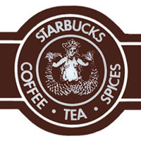
While the logo's current design is recognizable due to its simple line work and strong color contrast, it hasn't always looked like that. The original design for the Starbucks logo, used on the cups from 1971 to 1987, had a more elaborate illustration and a different color scheme. It was brown and white, and the text included coffee, tea, and spices. The siren herself was drawn in great detail, depicting a realistic female upper body that looked three-dimensional.
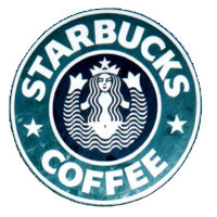
In 1987, the company redesigned the logo and ended up with...
 |
this.
 But it only lasted a few years until 1992 when the current Starbucks logo was introduced. It is drastically different from the first one. Though it maintains its circular shape, almost everything else has been altered in favor of a more modern design. The siren has been reduced into black and white shapes and lines, giving her a flat, two-dimensional quality. Her face is zoomed in so that the rest of her body is cropped out of the circle, and her long hair covers her chest. Essentially everything that characterized her as a realistic human has been eliminated in favor of a graphic representation of her face and hair. The textual element was also greatly simplified, changing from Starbucks Coffee, Tea, and Spices to just Starbucks Coffee. Because there are less words, the letters got bigger and bolder to fill up the space around the circle.
By changing the design, the logo became something appropriate for all ages, without the risqué nude female body in the first logo. As a result, Starbucks Coffee could appeal to a wider range of consumers and pull in more money. The new logo carries a more powerful visual presence than the other two previous designs due to its modern simplicity. Its use of bright green juxtaposed with the strong contrast between black and white makes the icon pop out at the viewer.
Both the 1971 design and the 1992 design represent the same company values and merchandise by using the a circular-shaped image of a siren, yet each logo employs very different design choices. These design choices impact each logo's effectiveness as the emblem of Starbucks Coffee. The original logo is subtle, and gives the impression that Starbucks is a local, small-town hangout spot. The nude female body seems to suggest that the store caters to a select group of people who are old enough to go inside.
On the other hand, the current logo has a more dominating presence that calls attention to the store. Even though some of the uniqueness of the original logo is lost, the "edited" version of the siren in the modern design makes Starbucks feel like a family-friendly place. Along with the change in logo came a shift in merchandise to include a wider range of non dairy and caffeine-free options so that more people could enjoy the Starbucks experience. While some of the charm of the original logo has faded with the new design, the ultimate goal is to create something people will recognize so that they return to that store on a regular basis. And with such a flashy logo, Starbucks will not be going out of business anytime soon.

No comments:
Post a Comment